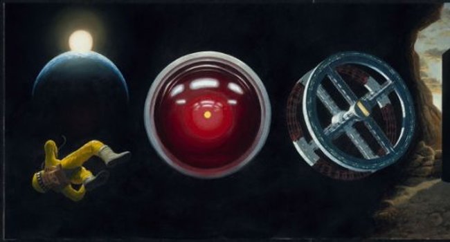
In the late 1960′s, Stanley Kubrick and Arthur C. Clarke teamed-up to create what is generally acknowledged as the greatest science fiction film ever made, 2001: A Space Odyssey. Now, Taschen has released their massive tome about the making of the film, and its pages capture all the spirit, effects, sets, costumes, concepts and the impact on its audiences of this unprecedented cinematic vision.
The Making of Stanley Kubrick’s ’2001: A Space Odyssey’
was born from a partnership between the Kubrick Estate, Paris-based design agency M/M, and writer Piers Bizony. The resulting volume is a massive, weighty black bound book shaped like the iconic monolith from the film. This version of the book contains all of Bizony’s writing from the Limited Edition version. The tall, skinny pages are full of tiny print — it makes the dense reading difficult to manage, but Bizony’s years of acclaimed, groundbreaking research make it worth the effort.
The text sections are broken up by loads of photographs from the set and stills from the movie. Concept drawings and painted designs offer first glimpses of the film they inspired and close-up stills of instrument panels, costume details and architectural flourishes constitute a kind of pornography for Kubrick geeks who’ll pore over every detail.
There are a lot of fold-out images here, which is novel and adds a sense of discovery to the leafing, but, like the reading, it’s also a little awkward and the thin paper had me nervous about tears when I first cracked this one. Taschen actually offers a fascinating apology for this and it’s worth quoting. You could call this The Making of The Making of Stanley Kubrick’s 2001: A Space Odyssey…
It is very rare that our design approach takes such an individual and strong position, since we usually strive not to steal the show to our contents/artists/artworks, but rather serve all our subjects with subtlety. In this case however, we agreed after a longer discussion (which included the publisher, the author, and also the Kubrick Estate) that simply reproducing the surface of this fabulous movie in a conventional, glossy book wouldn’t do justice to the more profound reflections that are inherent to Kubrick’s masterpiece – which can be perceived as “cold” in some regards in its monolithic, uncompromising execution, or even “brutal”.
So our designers – M/M (Paris) – conceived the book like an entire symphony of fold-outs (preferably experienced with the Blue Danube playing in the background), which requires active intervention by the reader, rather than the “classic” leaned-back consumption. We were convinced that this approach would do justice to Stanley Kubrick’s vision and methods, since 2OO1: A Space Odyssey (by the way also produced in the same unusual – horizontal – aspect ratio) was never intended to be an ordinary, shallowly consumable experience in the first place.
Actually, the book and its pages have held-up just fine and when the book is in its protective slip cover it looks great displayed length-wise on a shelf, making this volume a great conversation piece for any film lover. Despite the difficulties posed by the design, this book is challenging, beautiful and unique, just like its subject.


